Quasimodo said:
Great shots. I wondered if you both have some tips for how to make the b&w to pop out more? What I do now is I convert my photos to b&w in photoshop, then adjust the different color information, then add a contrast/brightness (basically pushing the contrast a bit up and a bit more brightness).
I am enclosing a shot I took of a group of people (the shot is taken approx. 100meters away with 5D II, and 70-200 IS II and a 2x extender III. The first is how it was originally with color, the second I have converted to b&w trying to make the subjects pop more out.
Feedback would be appreciated.
Gerhard.
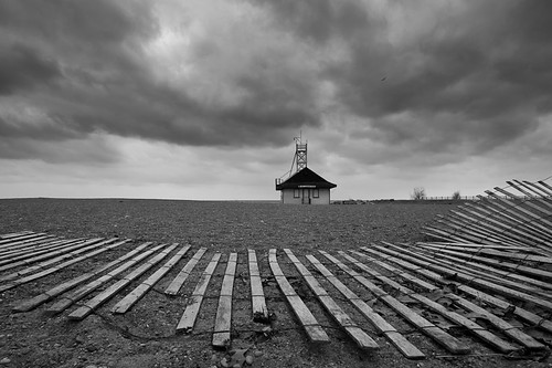
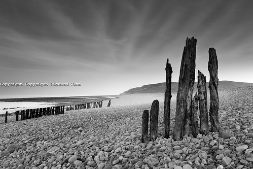
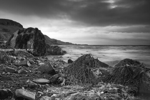
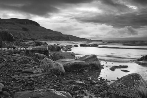
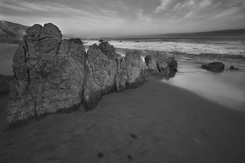
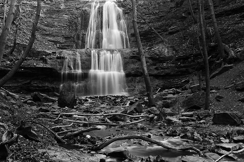
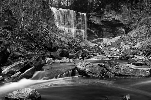
Thanks Gerhard. I tend to dabble in black and white, rather than specialise in it. As I said, there are a number of different ways to do the conversions. Obviously the simplest method is to switch to B&W mode on your camera. However, that rarely works well for digital. Digital films were developed over decades to produce the look that the classics, such as Ilford or the likes of Ansel Adams, digital just doesn't have that pedigree, so it has to be done in another way. When B&W film was used, different filters were used for different scenes, to highlight certain colours. That may seem strange, but to get the rich tones, you need the strong colours to start with. Digital is no different in that regard and often increasing the saturation before conversion can be the key, even if it means saturating to the point where it looks garish and horrible in colour. I often do a quick conversion first to see if it has anywhere to run, just to get a feel for how it might look with some work. Once I start though, I tend to add a curves adjustment layer and change it to strong contrast, that has the side effect of saturating the colours, at least in appearance anyway, it also deepens the shadow areas, which will give you good strong blacks after conversion. I then add a black and white layer and try the different filter presets to see which one I think works best for the scene; often that turns out to be the green filter. I then move the different colour sliders backwards and forwards until I get closer to the look I want. Once i have done that, I then think about whether any areas need further work. I may adjust the shadows and/or highlights or add a levels layer and adjust that way. Finally, for some images, particularly the first, third and last, I start dodging and burning specific areas to further increase the contrast between different textures. I did this for the sky areas on the Groynes image and for the clouds and rocks in the last two.
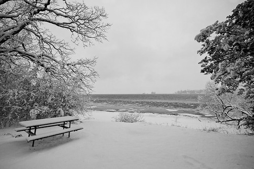
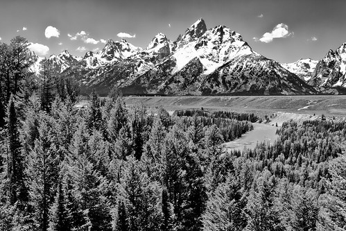
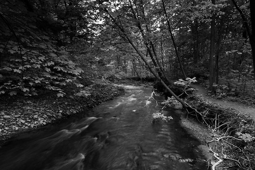
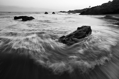
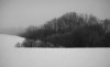
Not every image works in black and white and it is a very rare image that works equally well in colour and B&W. The key to a B&W image is top break it down to a simple level. If you are looking to convey a mood, then get it right and B&W will add the wow factor. Strong shapes and textures also work well. If you have rotting wood with strong textures, like in the groynes, that is a bonus, but anything that you can bring out with subtle micro-contrasts will work. |Triangular shapes also work well, so some triangular rocks also add a statement. However, while strong textures, shapes and contrasts are the obvious choice, don't rule out misty scenes, they may lack the textures, but with the right composition, there is a real mood there.
")